Color shades
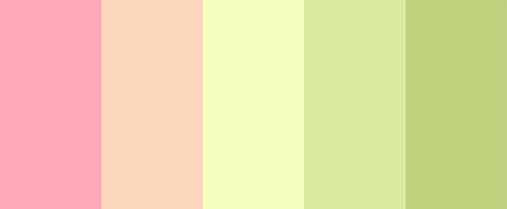
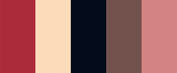
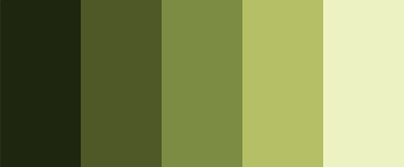
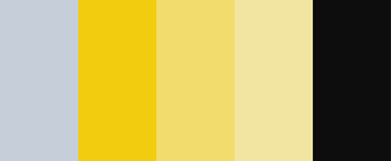
It contains a variety of shades of the selected color, namely shades, tints and others
Shades (low brightness)
To achieve a color shade, you mix the color with black , which makes it darker. By reducing the brightness of a color, it also reduces its saturation. Shades are great for hovering over links or as a background for the bottom and top of a website.
Tints (high brightness)
In this case, color blending with white is used , which reduces the darkness of the color. When you increase the brightness, it reduces its saturation. These shades can be used for hover effects and are great as backgrounds for modal windows.
Color tone (saturation)
The color shade is obtained by mixing color with gray . Since gray is a combination of white and black, it's equivalent to applying tinting and shading at the same time. Color shades are best for backgrounds because they are neutral and don't distract attention from the main elements, which usually have brighter and more saturated colors.
Cold
Colors are divided into 2 groups based on their temperature: warm and cool . Warm colors include yellow , orange , and red . Blue is a cool color. Defining color temperature is not definitive and is quite relative. For instance, each color can have warm and cool versions. In this case, we're mixing the chosen color with blue to obtain cooler shades.
Warm
On this palette, we mix the chosen color with red to achieve warmer shades. Color temperature is directly linked to color psychology. Traditionally, warm colors are associated with emotional warmth and compassion, while cool colors are linked to logic and seriousness. For example, many logos in the food industry are designed with warm shades such as yellow, orange, and red, as they appeal to our emotions (including hunger feelings ). On the other hand, business logos often use cool tones, including various shades of blue, as they convey a sense of seriousness and rationality.


